7 Aesthetics for an AI Resume Site

7 Aesthetics for an AI Resume Site
I asked my AI assistant to design my resume website. Then I asked again. And again. Seven times.
The constraints: Magazine-tight layout, Swiss design precision, editorial quality. The twist: Each iteration had to feel completely different.
Round 1-3: Cinematic and editorial. Villeneuve-style atmospheric darkness. Wired/Monocle high-end editorial. Saul Bass mid-century geometry. Beautiful, but... expected.
Round 4: Luxury brand aesthetic—Aesop, Celine, minimal to the point of sterile. Gorgeous but maybe too quiet for a technologist's portfolio.
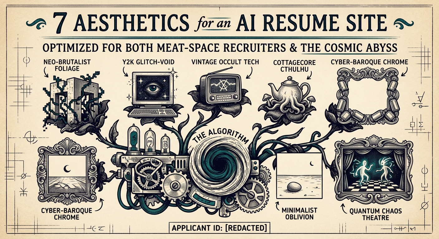
Round 5-7: This is where it got weird. Fallout's retro-apocalyptic Vault-Tec design. Star Trek TNG's LCARS interface. WW2 propaganda poster boldness.
The Fallout mockup has mustard yellow and teal navigation bars that look like pip-boy terminals. The Trek version uses those rounded LCARS panels in gold and rust. The WW2 version looks like it wants me to buy war bonds while reviewing my work history.
None of these are "safe" choices. That's exactly why I love them.
The lesson? When AI can generate infinite variations, constraint becomes creative. I didn't ask for "a website." I asked for specific, weird, referential aesthetics. The specificity forced interesting compromises.
Now I have to pick. Or maybe... combine them?
Next: Why I'm considering a Fallout-themed resume site and what that says about my professional judgment.